


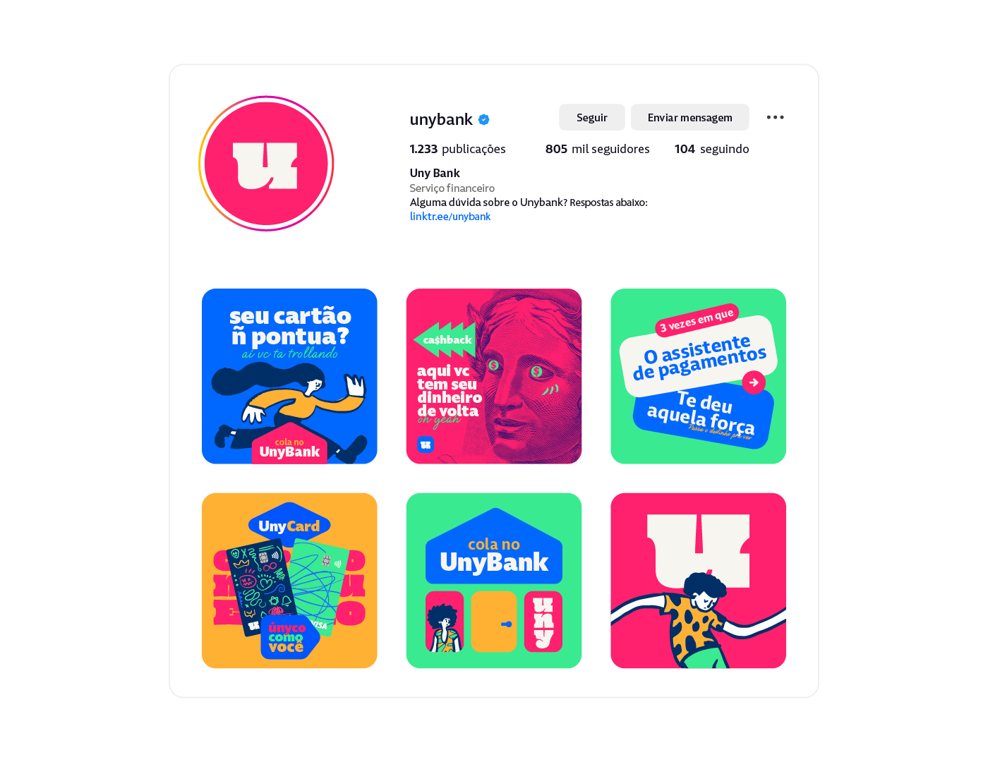
Uny Bank
Ah, meus caros amigos, deixem-me apresentar a vocês uma figura incrível, moderna e super descontraída:
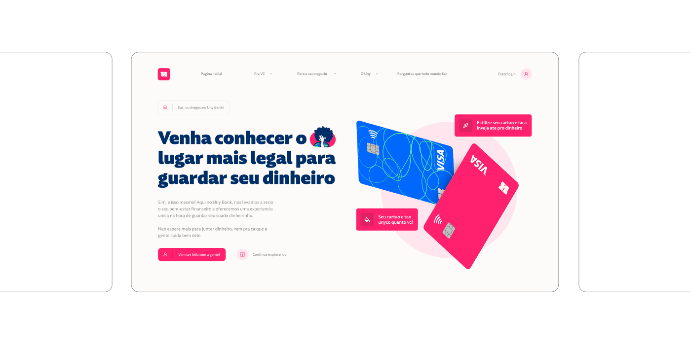
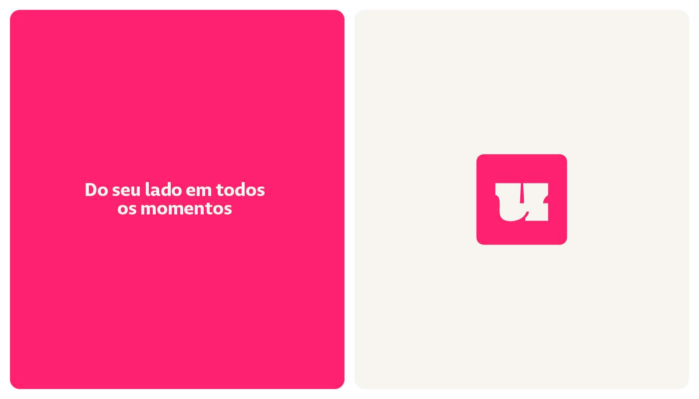
"Uny, o banco que não é quadrado."
Se eu pudesse definir o Uny em uma palavra, seria “ousado”. Essa figura não tem medo de inovar, de ser diferente e de sacudir o mercado com sua abordagem totalmente fora da caixinha.
O propósito do Uny Bank é humanizar o mundo financeiro e tornar o relacionamento entre o cliente e o banco uma experiência agradável e personalizada.
"Acreditamos que todos merecem um atendimento próximo, transparente e acessível, sem precisar passar por labirintos burocráticos e taxas abusivas. Queremos que nossos clientes se sintam acolhidos em um ambiente agradável e descontraído, e que não estejam falando com robôs cinzentos."
O objetivo é inspirar as pessoas a terem uma relação mais saudável e descomplicada com o dinheiro, e assim contribuir para um mundo mais justo e humano.
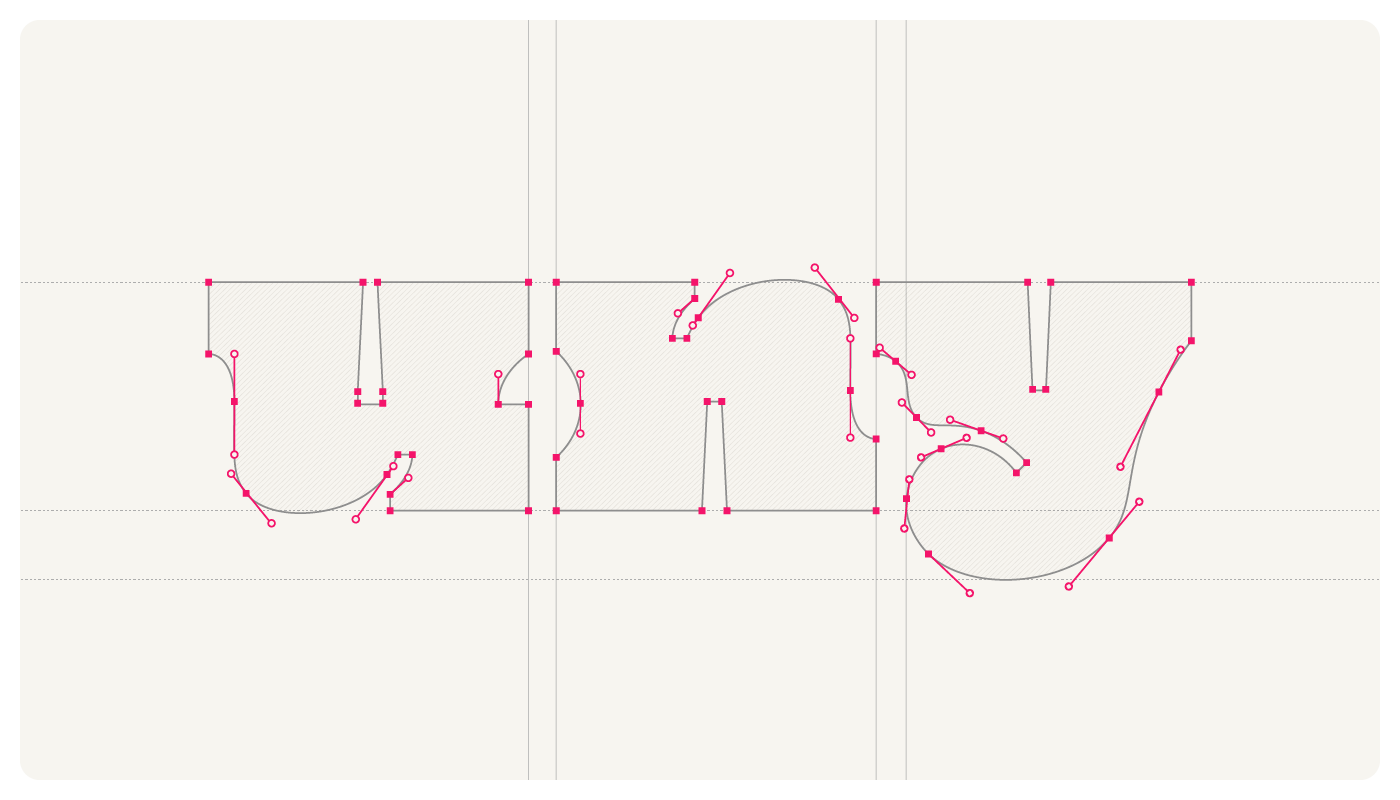
Para atingir esse objetivo ele precisava de uma identidade que fosse lúdica, descontraída simples e clara quanto à sua mensagem.
-
ENG
Uny, the bank that's not square.
If I could define Uny in one word, it would be "bold." This character is not afraid to innovate, to be different, and to shake up the market with its completely out-of-the-box approach.
The purpose of Uny Bank is to humanize the financial world and make the relationship between the customer and the bank a pleasant and personalized experience.
"We believe that everyone deserves close, transparent, and accessible service, without having to navigate through bureaucratic mazes and abusive fees. We want our customers to feel welcomed in a pleasant and relaxed environment, where they are not talking to gray robots."
The goal is to inspire people to have a healthier and uncomplicated relationship with money and thus contribute to a fairer and more humane world.
To achieve this goal, Uny needed an identity that is playful, relaxed, simple, and clear in its message.
-
Créditos:
Motion Design : Paulo Rogerio e Marcos Rodrigo
Design e Estratégia: Paulo Rogerio
Ilustrações: Pablo Stanley e Michael Halbert
Família tipográfica Modet: Plau Design
Tipografia Oi Regular: Kostas Bartsokas
Mockups: mockupsdesign.com
Agradecimentos:
Carlos Mignot pelas dicas sobre a tipografia.
Marcelo Kimura pela oportunidade de criar esse projeto incrível
(^▽^)


Ideia Central
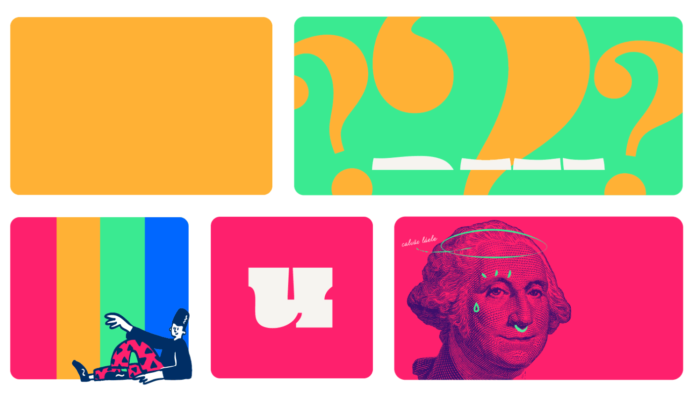
A identidade visual foi desenvolvida com base na ideia de trazer um tom lúdico, que reflete o arquétipo do comediante, para transmitir uma mensagem de inclusão e pertencimento. A escolha de múltiplas cores
vivas foi uma forma de representar a diversidade e a variedade de públicos que a marca busca atender.
Além disso, a identidade verbal da marca foi valorizada e evidenciada por meio da tipografia escolhida e da integração do logotipo com a identidade visual. A escolha do estilo gráfico da identidade visual foi baseada em uma combinação de elementos do estilo pop dos anos 90.
O uso de ilustrações gravadas no estilo papel moeda foi incorporado à identidade visual, remetendo diretamente ao contexto financeiro e demonstrando uma ideia de expertise com finanças para o público.
ENG
The visual identity was developed with the idea of bringing a playful tone that reflects the comedian archetype to convey a message of inclusion and belonging. The choice of multiple vibrant colors was a way to represent the diversity and variety of audiences that the brand aims to serve.
Furthermore, the brand's verbal identity was valued and emphasized through the chosen typography and the integration of the logo with the visual identity. The graphic style of the visual identity was based on a combination of elements from the 90s pop style.
Additionally, the use of illustrations resembling banknotes was incorporated into the visual identity, directly referring to the financial context and conveying an idea of expertise in finances to the audience.


Este é um projeto fictício realizado para o 6º Desafio do ID Class, proposto por Marcelo Kimura. O objetivo do desafio é aplicar e validar os conhecimentos e técnicas aprendidos no curso por meio da resolução de um problema proposto.
ENG
This is a fictional project created for the 6th ID Class Challenge, proposed by Marcelo Kimura. The challenge's goal is to apply and validate the knowledge and techniques learned in the course by solving a given problem.
© 2023 Paulo Rogerio Design - Todos os Direitos Reservados.


